Build a Dashboard for Your Daily Task Management
TL;DR
I built a dashboard/scoreboard to integrate productivity data from different apps. This allows me to design my own widgets and support my daily operations. It’s a self-hosted solution based on open-source software and libraries, which runs on a server and web browser and can be accessed basically from anywhere.
Managing daily tasks can be challenging. I love productivity apps; for example, I like Things and Structured. They are clean and minimalistic and helpful, but lack features that motivate users to achieve more. That’s why I want to build my own dashboard — one that is compelling. Business intelligence is powerful — let’s apply it in real life!
Think outside the Box
The inventor of the water flosser showed us that liquid can act like floss. Likewise, e-ink devices—though made for reading—can serve as dashboards or dynamic whiteboards. While Grafana is built for system monitoring, you can treat your day as a system, with time-management metrics just like any other performance data. When combining these ideas, something almost alchemical happens: the tools start to work together in surprising ways. Standard time-management methods suit most people—but they’ve never fully met my needs. My approach gives an intuitive, bird’s-eye view of my life and even rewards me for staying on track.
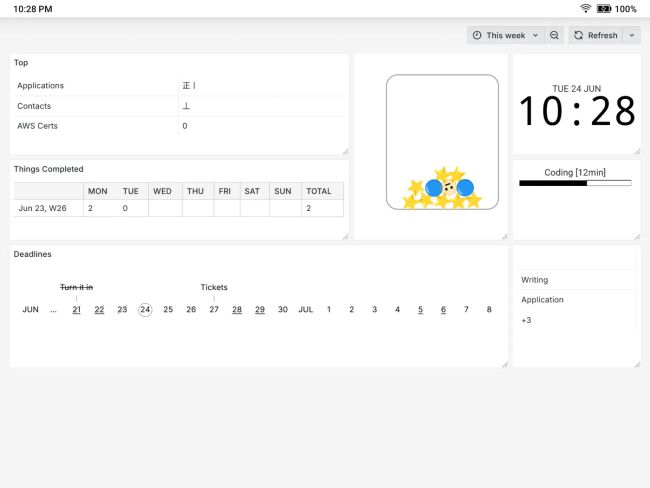
Below is a demonstration of my daily dashboard:

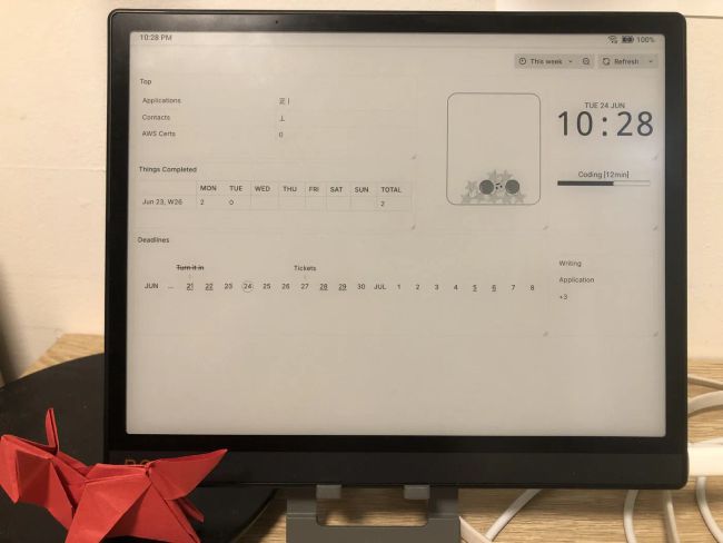
On an E-ink device, it looks like this:

The Advantages of This Approach
Fill in the Motivation Gap
Most productivity apps don’t include motivational features (an area in which Duolingo excels). While it is correct for a product manager to stay within the app’s designed scope, users probably want more. Although the app itself is minimalist, we still need to find ways to motivate ourselves to use it. Visualisation is a good way to motivate ourselves after completing a task that we probably won’t remember afterwards.
Act as a Shortcut to Daily Planning
My previous daily planning method involved a long checklist to go through in the morning because I didn’t want to miss anything, which was a bit of a burden. Now, with just one glance at the dashboard, I can see what I need to do, so I don’t need to do a thorough version every day (I can do that thorough version once or twice a week to save time). Besides, with a very small amount of information to consider, I won’t feel overwhelmed when planning.
Borrow the Abilities of Open Source Software
Grafana is a powerful tool for monitoring metrics and performance. It is possible to make full use of this feature. For example, we can build alert rules for our dashboard, and, since Grafana is already integrated with lots of messaging and alert platforms, we can enjoy this capability instantly. Therefore, our dashboard can actively monitor metrics and notify us in case we forget to arrange things properly.
Visualise in Basically Any way
D3.js is extremely powerful when it comes to creative data visualisation. We can build non-standard graphs and charts, or anything else that can be rendered in web browsers, and update them frequently and automatically. This aligns with 4DX’s philosophy of creating compelling scoreboards, as standard charts may not clearly reflect the correct leading measures.
Separate Read-write Actions
This is a basic model of read-write separation. I still use the original apps to produce data. For example, I use Things as my main to-do list app and enjoy its clean UI and features such as syncing, cross-platform support and native notifications. My dashboard doesn’t modify the data; it’s just a visualisation tool. However, changes made in the app are reflected on my dashboard.
What Do You Need to Build a Dashboard like This?
Hardware in a Nutshell
- A server
- A device capable of running modern browsers
- A computer to monitor and upload your data
The solution is browser-based, so if your device supports modern browser capabilities, you can put your dashboard there. However, you will still need a server to run Grafana and related services. This could be an affordable VPS with internet access, or if you don’t need to access it outside your home, you could use any idle computer. If, like me, you use Things and Structured App, it’s better to use a Mac device as an uploader.
On top of that
If you are exposing your services on the internet, it is recommended that you use a domain and HTTPS for security. A Cloudflare tunnel is also useful if you want to make your home server accessible.
E-ink devices are also excellent if you want to make your dashboard always available without straining your eyes, as is my preference. Devices capable of installing Firefox or Chrome on Android are a good fit. Remember to try them out before you purchase one.
Knowledge You Will Need
| Domain | OK to Go |
|---|---|
| Basics about server management | If you can manage services running in a Docker container and able to configure them correctly |
| Database basics | If you can fetch the data you want using basic SQL queries |
| JavaScript basics | If you can modify JS scripts for minor adjustments and debug them |
| Shell scripting/command-line basics | If you can modify shell scripts for minor adjustments and debug them |
You don’t have to be a pro, but you do need to be able to collaborate with AI to achieve your goals.
Architect Overview
The architect I applied:
| Frontend | Data Storage | Storage Connector | Uploader |
|---|---|---|---|
| Grafana | SQLite (file) | Rclone mounting Minio (S3) | - Minio client (mc) on Mac - LaunchAgent to watch folders for automation |
Alternatively, you can do:
Grafana ···PSQL Protocol··· ROAPI + Any data source ROAPI can connect
or
Pure HTML (D3.js) ···HTTP API··· ROAPI + Any data source ROAPI can connect
if authentication is not something you are concerned about.
Get Your hands Dirty!
Head to Map Your Things Deadlines on a More Intuitive Timeline for creating a deadline in a timeline format for Things.
Theoretical Considerations
The 4 Disciplines of Execution
This describes how to build a compelling scoreboard, which we have done using this technology stack.
- https://www.franklincovey.com/courses/the-4-disciplines/
- https://www.goodreads.com/book/show/13260184-the-4-disciplines-of-execution
Effective Decision Making
The way I designed my dashboard incorporates many of the key points from this module. For example, I opted for a timeline to illustrate deadlines instead of using the original deadlines view in Things, as icon diagrams and well-designed graphs can facilitate the communication of complex quantitative information. It’s easier to get a sense of how far away a deadline is than to be told ‘6 days left’.